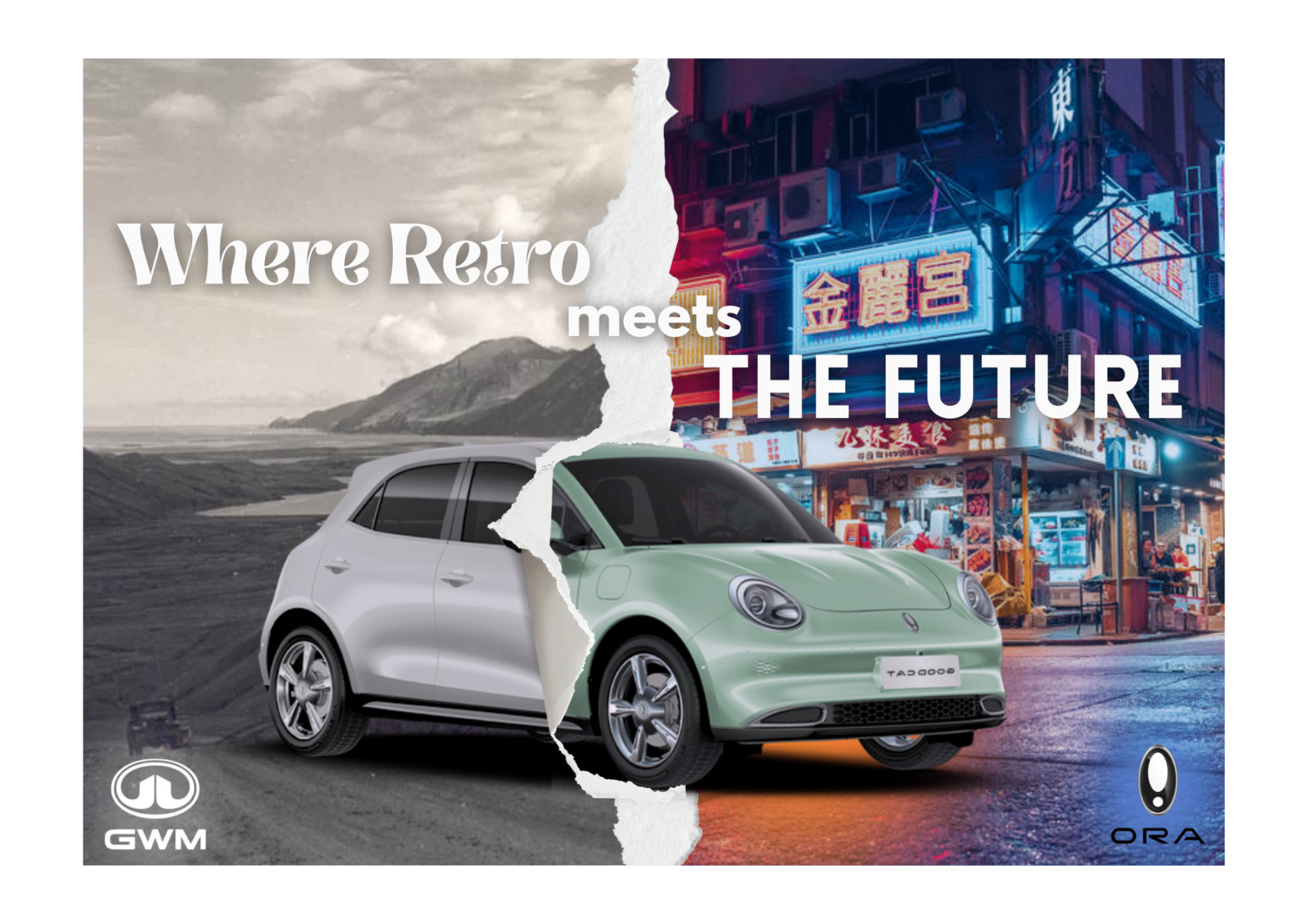
This marketing visual was designed as part of a marketing module exploring Dimensionality Alteration, where 2D and 3D elements are combined to create contrast, depth, and visual storytelling.
The concept showcases the ORA Good Cat as a car that bridges two worlds. The left side is styled as a retro, monochrome landscape to represent the past, while the right side features a vibrant, neon-lit city to symbolize the future of electric mobility. The torn-paper transition acts as the dimensional break, visually shifting from an old-school aesthetic into a modern, high-tech environment.
By placing the car across both dimensions, the design highlights how the ORA Good Cat blends vintage charm with futuristic innovation. This project demonstrates my ability to use dimensionality alteration to communicate a brand narrative through contrast in colour, texture, and spatial depth.
Concept Overview
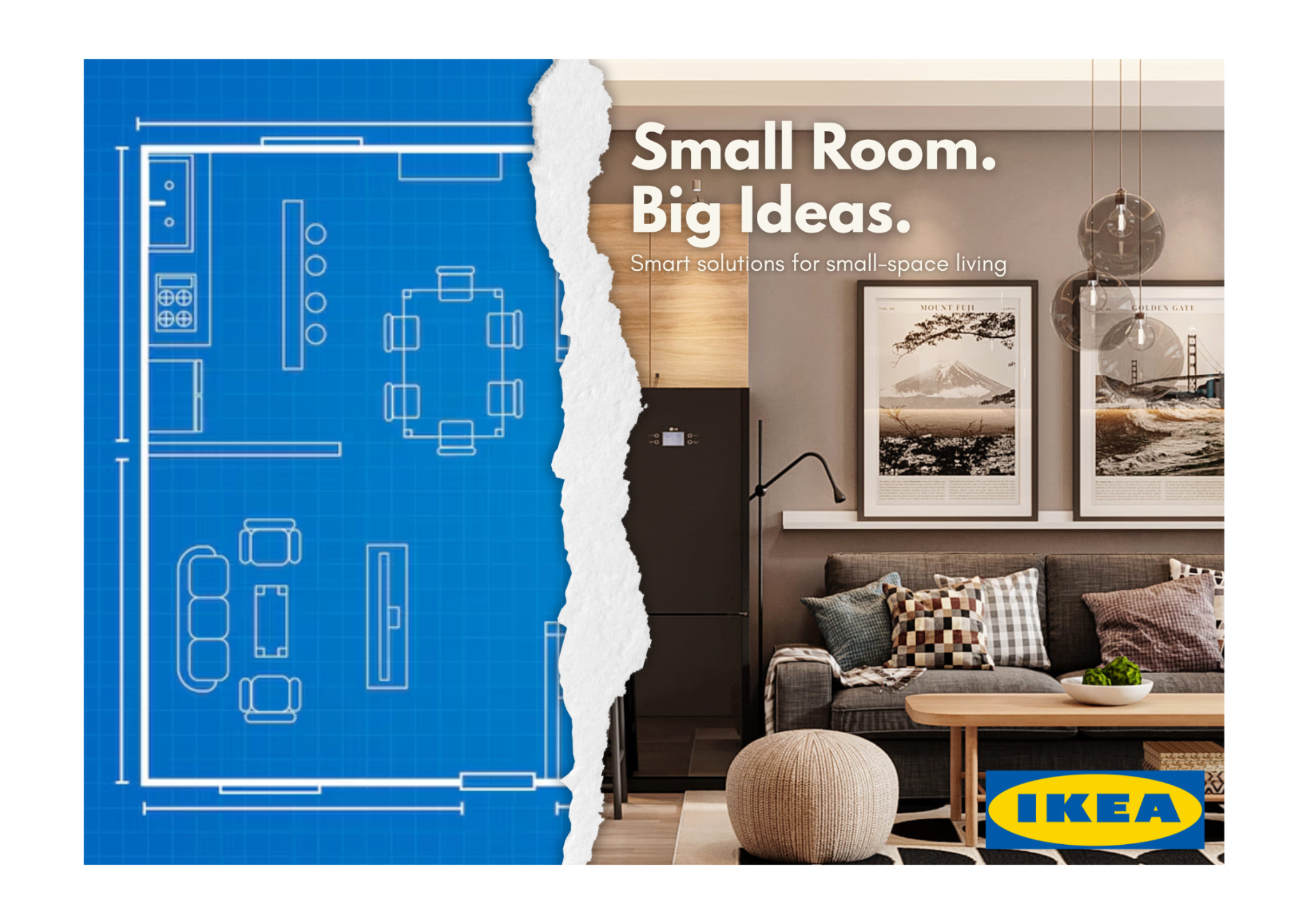
This piece is an alternate execution of the Dimensionality Alteration / Taxonomy technique explored in my earlier ORA Good Cat poster. For this version, I applied the same creative method to IKEA to demonstrate how the appeal can be adapted across different brands and campaign styles.
Creative Idea
I designed a visual transformation from a 2D architectural blueprint into a fully furnished IKEA living space. The torn-paper transition serves as the “dimensional break,” symbolising how IKEA solutions open up possibilities in small homes. On the left, the flat blueprint represents potential; on the right, the warm Scandinavian interior reflects how IKEA brings that potential to life.
Objective
The goal was to showcase IKEA’s strength in small-space living and turn the abstract idea of “smart design” into a clear visual metaphor. By using dimensional alteration, the poster highlights how IKEA transforms tight, empty layouts into functional and inviting rooms.
Brand Relevance
IKEA already emphasises affordability, practicality, and clever small-space solutions. This concept aligns with their brand by celebrating everyday living while visually reinforcing their design philosophy:
“Small room. Big ideas.”
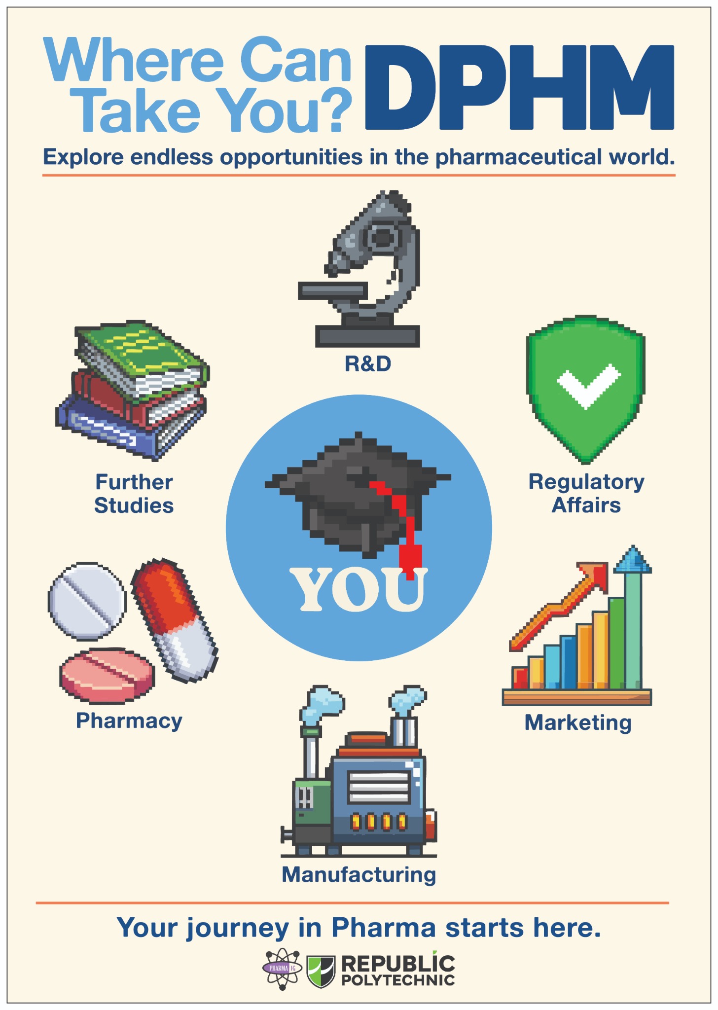
This poster was created for the Diploma in Pharmaceutical Science (DPHM) Open House. The aim was to showcase the different career pathways available in the pharmaceutical industry in a way that was simple, friendly, and easy for future students to understand.
I designed the poster using a pixel-art visual style to make it eye-catching and approachable. Each icon represents a key pathway in the diploma — R&D, Manufacturing, Regulatory Affairs, Marketing, Pharmacy, and Further Studies. The layout focuses on keeping the information clear while still looking fun and engaging for a younger audience.
The final outcome is a clean, informative poster that communicates opportunities at a glance and fits the branding of an education-focused event.

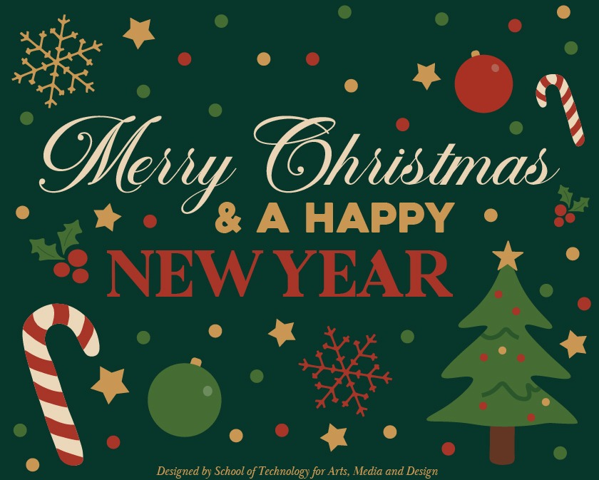
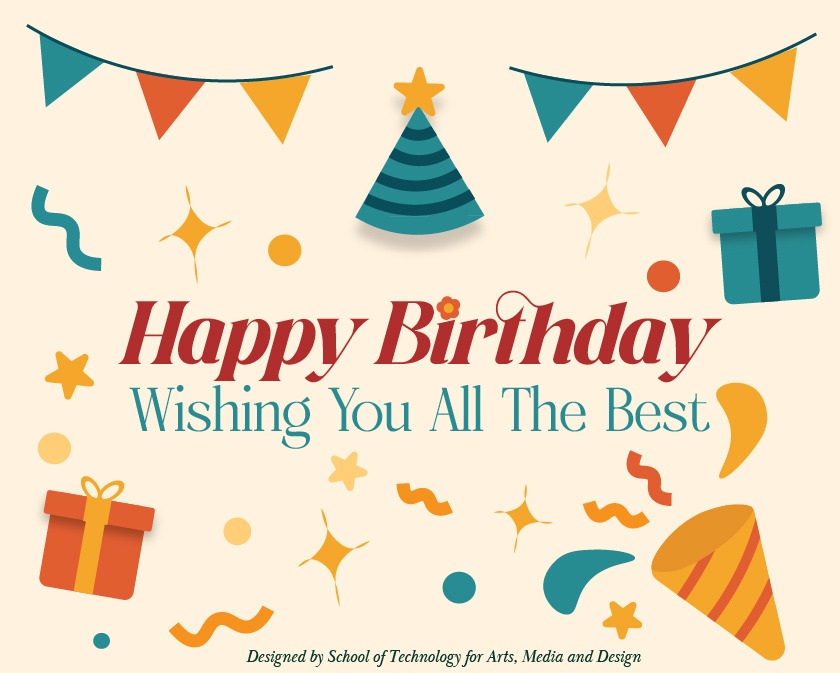
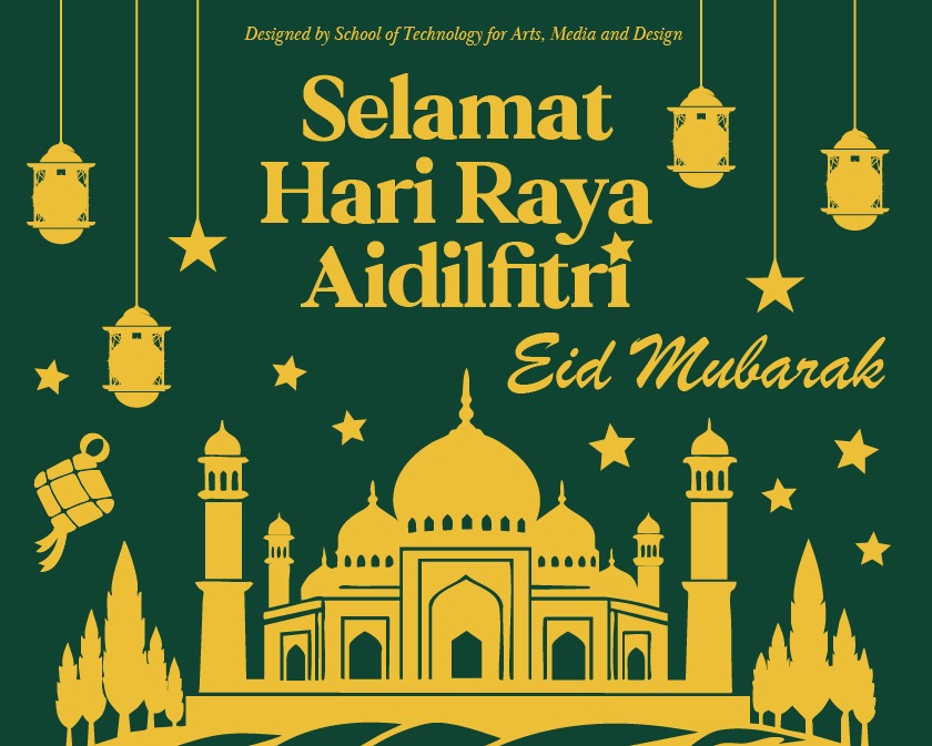
This series features a collection of festive greeting cards created for various celebrations, including Hari Raya Aidilfitri, Christmas & New Year, and Birthday occasions. Each design focuses on bright, cheerful visuals while keeping the layout clean and easy to read.
I experimented with different colour palettes and motifs for each theme — such as traditional lanterns and mosques for Hari Raya, winter elements for Christmas, and playful icons for birthday greetings. The goal was to create versatile, eye-catching cards suitable for both print and digital use.
These designs highlight my ability to work with festival-based visuals, typography pairing, and consistent thematic styling across multiple cards.
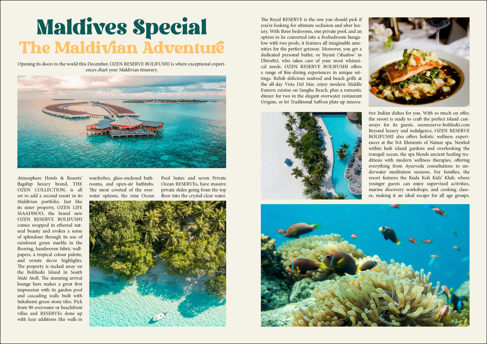
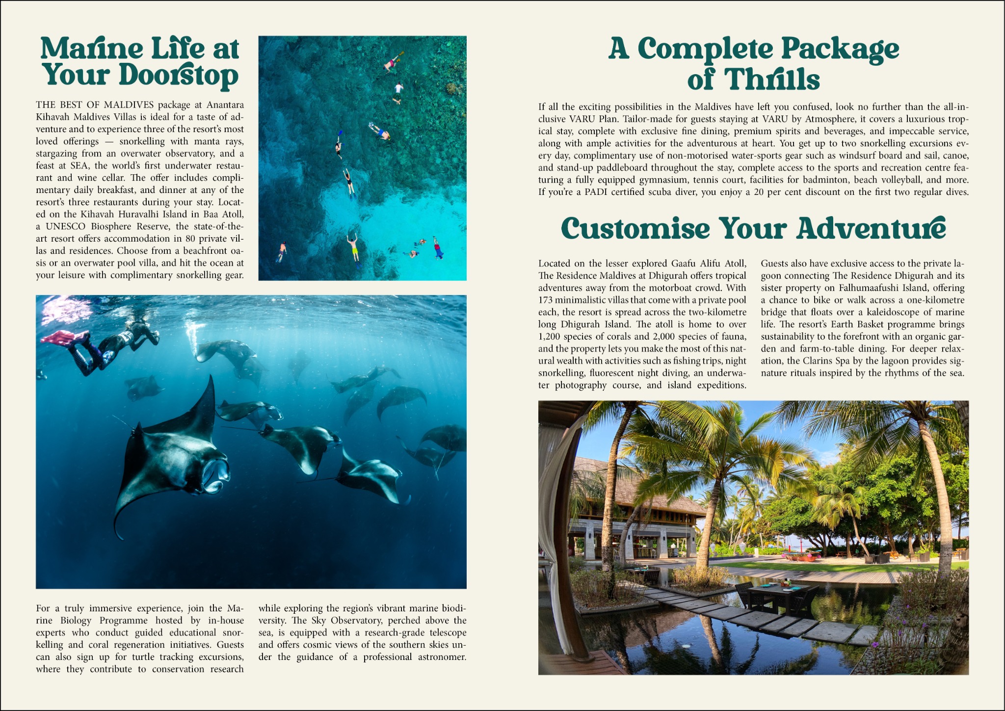
This two-page magazine spread was created for my Color and Typography module, where we explored how layout design, type hierarchy, and visual balance work together in publication design. The task required us to design a travel feature using Adobe InDesign, applying proper grid structures, consistent typography, and a cohesive colour palette.
The spread showcases a Maldives travel article, combining large hero images with supporting visuals to create an immersive, editorial feel. I used a warm, tropical colour scheme and paired serif and sans-serif fonts to establish clear hierarchy between headings, subheadings, and body text. The layout follows a multi-column grid system, ensuring readability and professional alignment throughout the pages.
This project demonstrates my ability to design editorial content, manage typography effectively, and create visually appealing magazine layouts using InDesign.