Routine Coffee is a conceptual café brand created for my Graphic Design module. The project focused on developing a cohesive visual identity across logo design, colour palette, typography, and marketing collaterals. The aim was to craft a brand that feels warm, friendly, and modern — a café where everyday routines become comforting rituals.
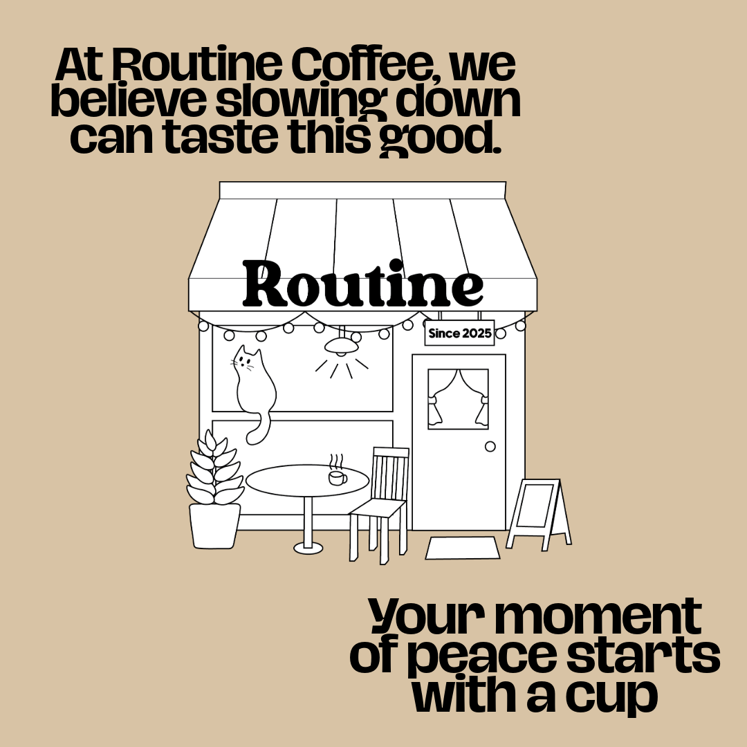
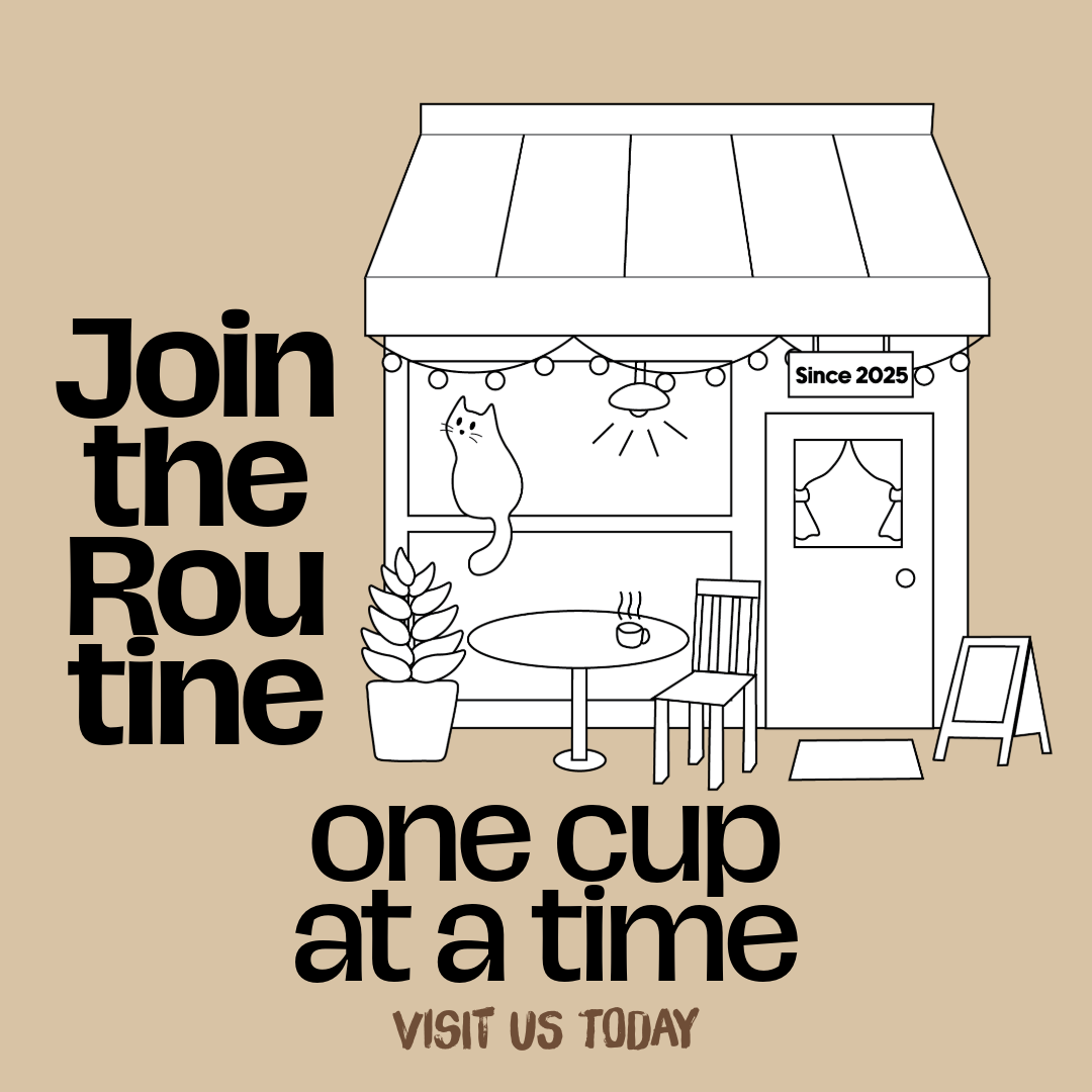
Routine Coffee’s identity is built around the idea of simplicity and consistency. The brand represents a calm, reliable space where people start their day, take a break, or unwind after work. The visuals are intentionally soft and approachable, reflecting comfort, routine, and a steady rhythm.
Keywords:
minimal, warm, approachable, familiar, lifestyle-oriented
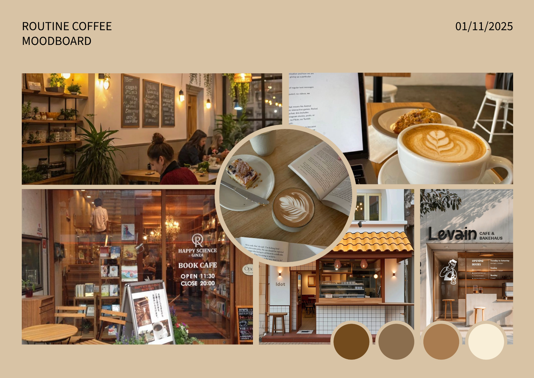
This moodboard sets the visual direction for Routine Coffee, a conceptual café brand designed for my Graphic Design module. The references focus on warm, cozy café interiors, soft lighting, natural textures, and quiet lifestyle moments like reading with a latte. These visuals help establish the brand’s personality — calm, familiar, and comforting.
The colour palette is inspired by earthy coffee tones: mocha browns, soft creams, and muted neutrals. These shades reflect warmth and simplicity, supporting the idea of a café that feels like part of your daily routine. The moodboard also includes inspiration from book cafés and minimalist storefronts, which guided the brand’s welcoming and relaxed aesthetic.

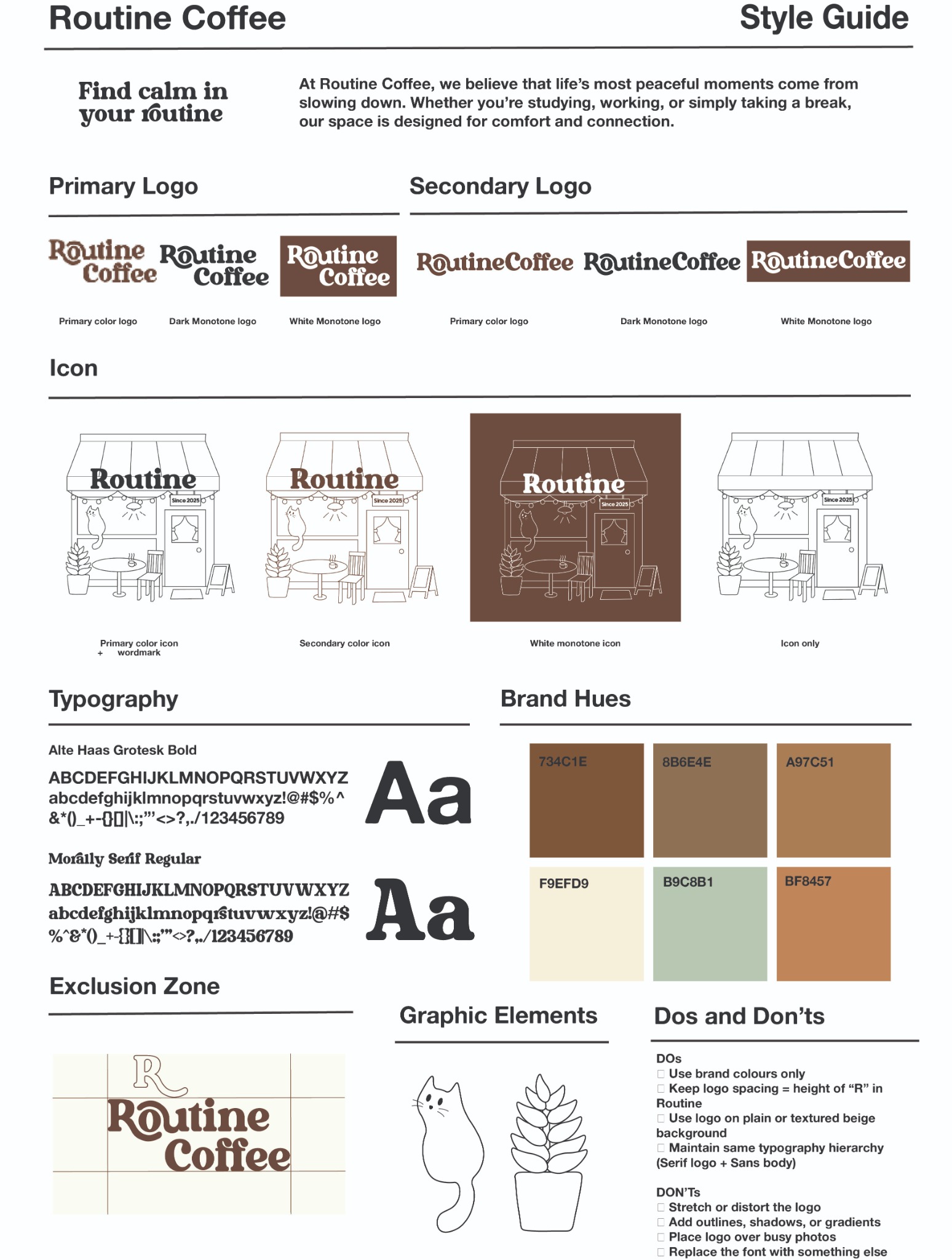
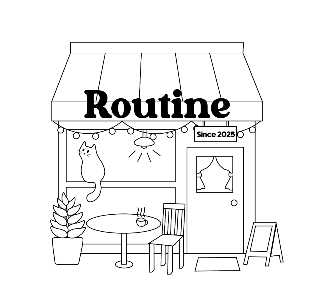
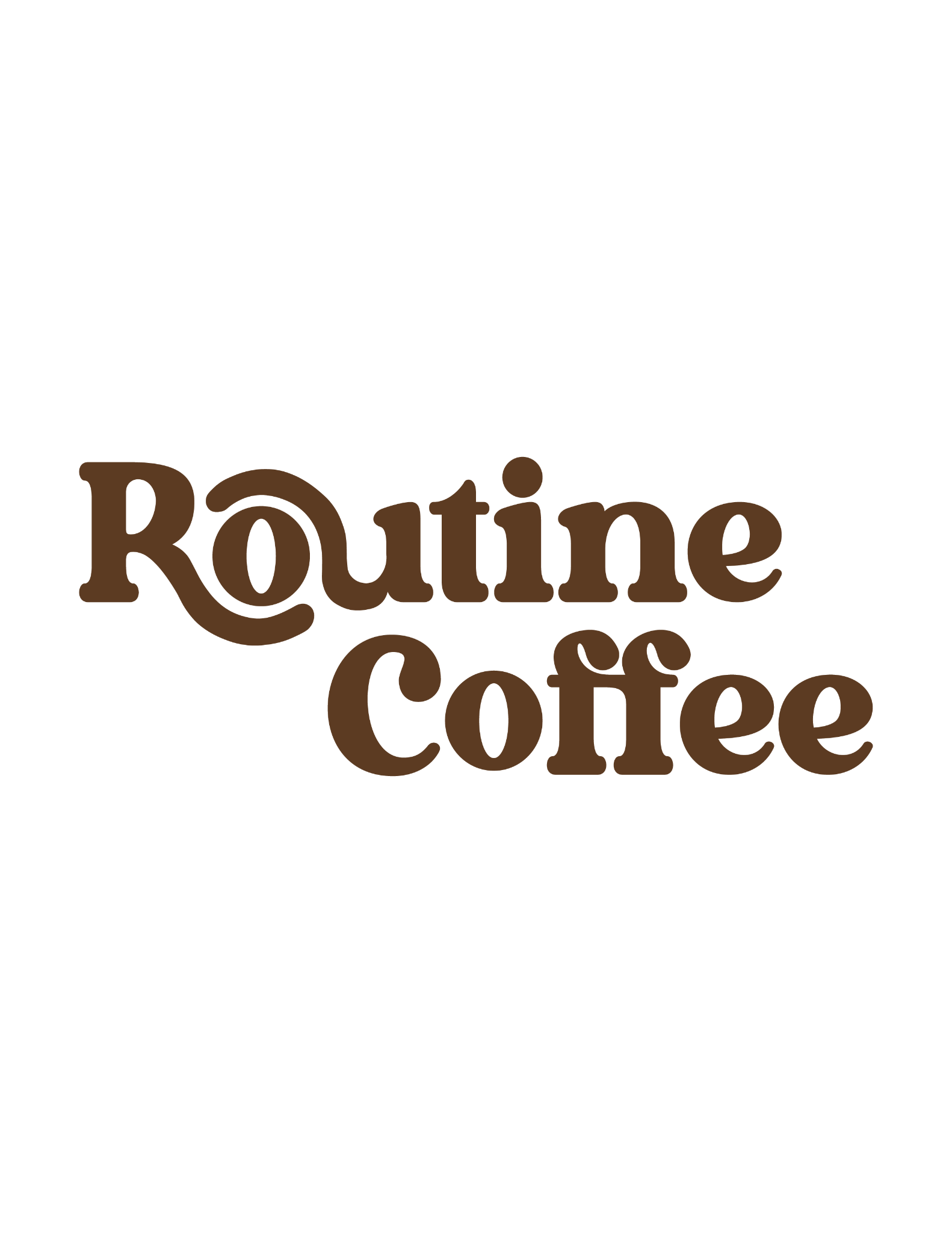
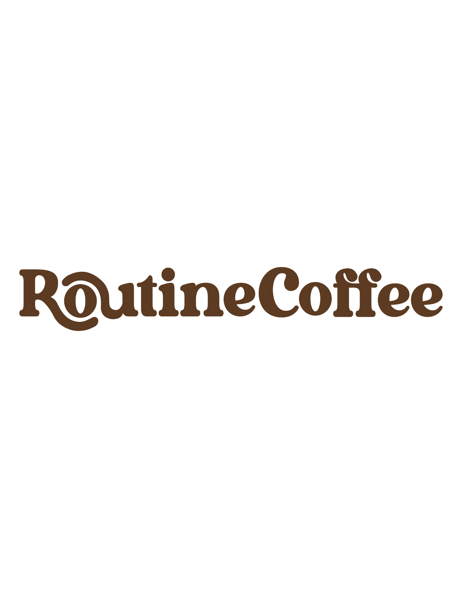
This style guide outlines the full visual identity system for Routine Coffee, including logo variations, colour usage, typography, icons, and brand guidelines. The purpose of this guide is to ensure that the brand remains consistent, recognisable, and visually cohesive across all applications.
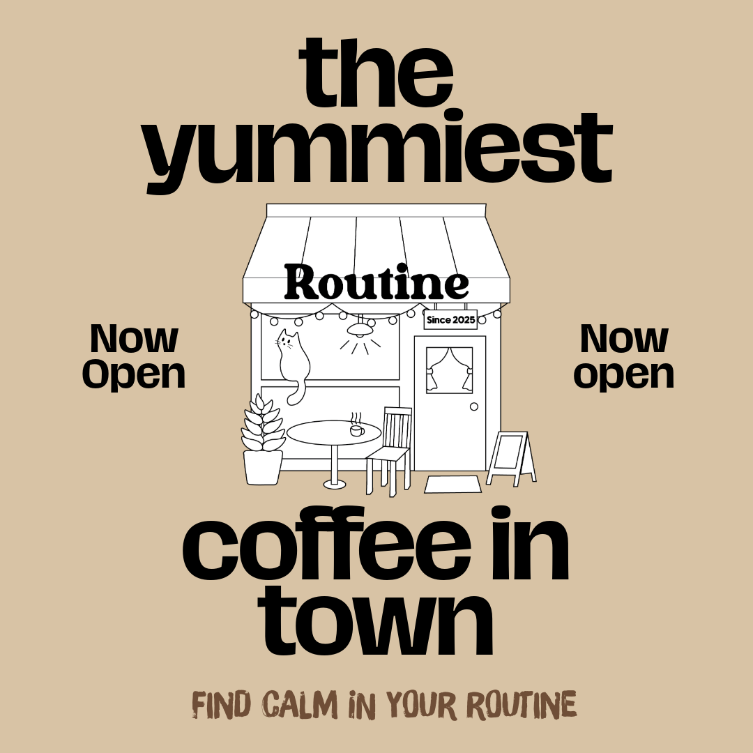
The branding uses a combination of warm coffee-inspired hues, serif headline typography, and clean sans-serif body text to create a comforting and approachable aesthetic. Multiple logo formats — primary, secondary, and monotone — allow flexibility for digital, print, and merchandise. The illustrated storefront icon reinforces the brand’s cozy, neighbourhood-café personality.
The guide also defines the brand’s exclusion zone, approved graphic elements, and strict dos and don’ts. These rules help maintain visual clarity, prevent distortion, and preserve the brand’s identity across all future designs. Overall, this style guide demonstrates my ability to develop structured, professional branding systems with clear design rationale.
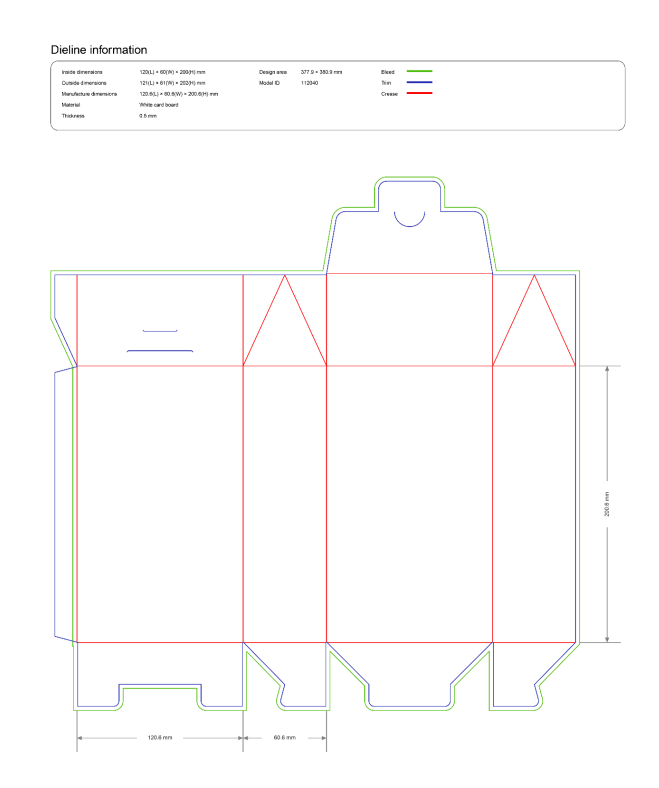
This dieline is part of the packaging development process for Routine Coffee’s coffee bean bag. Before creating the final visual design, I constructed the structural layout in Adobe Illustrator using proper printing guidelines. The dieline includes all necessary cut lines, fold lines, glue areas, and dimensions, ensuring the packaging can be accurately produced and assembled.
Creating the dieline first allows the final artwork to fit perfectly onto the physical structure without distortion or misalignment. This step is essential in packaging design, as it ensures that every panel, flap, and fold is accounted for before applying branding elements.
This process demonstrates my understanding of packaging structure, precision in measurements, and the technical foundation required for professional packaging design.